A River Runs Through This Website
There is a river running through the footer of this website.
Not a metaphor. Not an aesthetic choice dressed up as a concept. An actual river — or more precisely, a typeface built from the satellite geometry of Amazon tributaries, tracing the bends and oxbows of real waterways into letterforms. It spells out sarath tharayil. It fades before it reaches the bottom of the page, half-visible, like something seen through water.
The font is called Igaratipo. Most people will scroll past it without stopping. But once you know what you are looking at, it is hard to unsee.
Rivers as letters
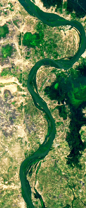
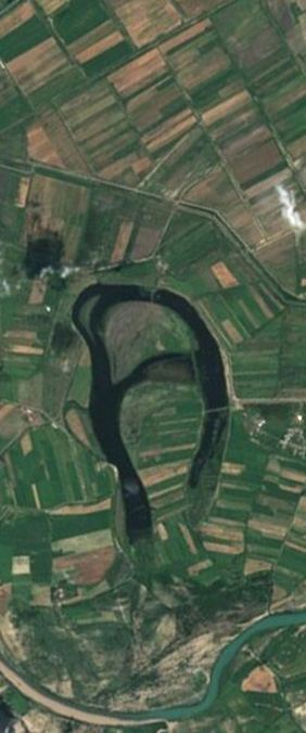
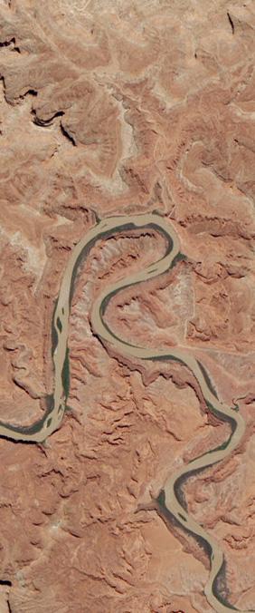
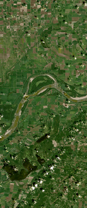
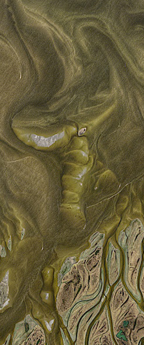
The Amazon basin contains roughly 1,100 tributaries. From the ground, they are rivers, things you cross by boat, things that flood, things that separate one community from another. From space, they look completely different. The bends, the oxbows, the way a river doubles back on itself before continuing: seen from far enough away, these shapes start to look like something else entirely. They start to look like writing.
Igaratipo was created by FutureBrand São Paulo as part of a new tourism identity for Brazil's Legal Amazon, covering nine states, 722 cities, and 28 million people, consolidated under a single regional brand called Amazonia. The project was led by Integrated Amazon Routes (RAI) and Brazil's Tourism Board (Embratur).
The name comes from igarapé, a word in Tupi-Guaraní meaning small stream.
The process was not metaphorical. The designers used actual satellite imagery and real geographic coordinates to extract letterforms from the river system. Each character in the alphabet corresponds to a section of an actual Amazon tributary. The curves are not approximations of rivers. They are rivers.
The NASA parallel
NASA has a tool under their Landsat program that lets you type your name and see it spelled out using satellite images of rivers from around the world. The Landsat satellites have been observing Earth since 1972, over five decades of continuous imagery, and somewhere in that archive is a river bend that looks like every letter of the alphabet.
I typed my name in. Each letter came back as a different river, a different country, a different coordinate on the planet.
The two projects are related in spirit but different in intent. The Landsat tool is playful, a way of making satellite data tangible to people who would never otherwise interact with it. Igaratipo is a branding system, one that has to function as a font, at scale, across nine states, and hold its own against actual commercial type.
What they share is the underlying premise: that rivers, observed from the right distance, contain language. That the planet has been writing in forms we only recently learned to read.
What the typeface actually looks like
Igaratipo is fluid in the way handwriting is fluid, but stranger. The letters do not sit on a baseline cleanly. They drift slightly, which makes sense once you know the source material. Rivers do not flow in straight lines either.
There is also an interactive version of the typeface where you can generate your own name and adjust parameters like the river's bends, flow, width, turbulence, and current. You can export the result as an image, a vector, or a video. The letterforms are not static; they can be made to move, which is exactly what rivers do.
Then I thought about putting it somewhere on this website and it seemed obvious where it should go.
Why the footer
The footer of a website is the last thing you see. On most sites it is a list of links and a copyright notice, functional and forgettable. I wanted mine to have something quieter than that, not a statement, just a presence.
The SVG file of my name in Igaratipo lives in the footer now, fading out with a gradient before it reaches the bottom. It reads sarath tharayil, though you might have to look for it. On desktop it appears at full width, the script stretching edge to edge the way a river would on a satellite map. On mobile it scales down but still shows the whole thing.
It matches the accent colour of whatever theme you are using on the site. In the amber-dark default it glows like the Amazon in dry season. In the teal ocean theme it looks like water.
On geography becoming language
What I keep thinking about is the direction of the conversion. Language usually turns into geography: we name rivers, we name mountains, we put letters on maps. Igaratipo goes the other way. It takes geography and turns it back into letters. It finds the alphabet hiding inside the landscape.
The illustrator Winy Tapajós, who contributed to the Amazonia brand project, said something that has stayed with me: "we don't have just one, but many Amazons. And frankly I cannot say that my creation speaks for all."
That feels right. A river system that large does not resolve into a single thing. But a typeface drawn from it at least acknowledges the shape of it. Not the ecology, not the politics, not the flooding. Just the shape, seen from far enough away that you can read it.
The footer of this site is a small and probably self-indulgent use of that idea. But the idea itself is worth knowing about.
If this was worth sharing, send it to someone on 𝕏 or LinkedIn. Got a question or a thought? Drop me a message , I read everything. If this was worth your time, .